Silhouette Studio users often complain the colors of their exported PNG and JPEG files, specifically, are "off". In this tutorial I'll show you how to improve your print colors so you get bright, beautiful, and vibrant colors when exporting from Silhouette Studio.
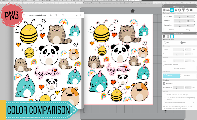
It's hard not to notice when you save a file, image, or design out of Silhouette Studio the colors are muted - it's most noticeable with PNG files. The saved file (on the left below) often has colors that are more dull, lower contrast, and honestly not very close to what you're seeing in the Silhouette Studio work area.
To get the best looking images, for things like stickers, when exporting from the Silhouette software, take one additional step and run the design through Image Effects tool.
The Image Effects tool is found on the right sidebar and has lots of color correcting options. We're going to focus on the Contrast, Brightness, and Saturation tab which is the one that looks like a sun.
With the Image Effects Tool open, select your design - in this case a sheet of stickers - and do three things:
- Reduce the Brightness
- Increase the Contrast
- Increase the Saturation
I started by reducing the brightness to -7 and increased both the contrast and saturation to 18.
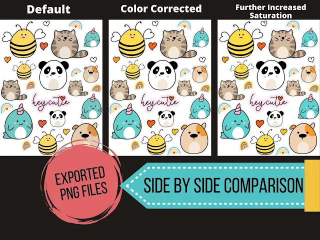
The resulting colors in the exported file were much closer to what they should be compared to the export using the default color settings.
If you're satisfied you're all set - if you're not try bumping up the Saturation a little more.
When I moved it up to 26 then exported again it was the closest color-match to the original design in Silhouette Studio.
The degree to which you'll adjust these will really depend on the colors and design itself as there's no set rule. Keep in mind, in Silhouette Studio it's going to look like you're sticker designs are overly color corrected, but remember you're overcompensating for Silhouette Studio's colors on export.
As a comparison I exported this file as a PNG from Silhouette Studio with the default colors and then separately with the color corrections, you can see the difference it makes when they're side by side.
This is really important if you're exporting to print through another print manager such as the Sawgrass sublimation print manager or are using for mock ups.
Note: This post may contain affiliate links. By clicking on them and purchasing products through my links, I receive a small commission. That's what helps fund Silhouette School so I can keep buying new Silhouette-related products to show you how to get the most out of your machine!
Get Silhouette School lessons delivered to your email inbox! Select Once Daily or Weekly.


.png)


This comment has been removed by the author.
ReplyDeleteHow clever! Love knowing how to make things brighter within the Silhouette program.
ReplyDeleteCan you please explain how to have two panels open on the right hand-side? I see you have the "Image Effects" and the "Page Setup" open, I am only able to have one or the other.
Thank you again,
Shari
Wow! I wish I had known this a long time ago.Yesterday I sublimated a design onto a tumbler and wished it had turned out more vivid. I just made the changes like you suggested and can really tell a difference. Can't wait to put it on a tumbler now.
ReplyDeleteIs this on the basic version. I can't find it.
ReplyDeleteI can't find it either, and I am running Designer edition....
DeleteI see that they don't answer any questions here :(
Image Effects (b/w, tint, color saturation) is available on all versions! It's easiest to find in your top bar, just go to panels> image effects.
DeleteOne of the best tips I have ever used, really made a difference, thankyou!
ReplyDeleteI haven't noticed a difference using this unfortunately. I was hoping this would fix the issue. Just really disappointed that they do not export the why I am designing the images.
ReplyDeleteHi there! You may want to do some research into your monitor's color settings if you're still noticing discrepancies.
DeleteShould you do this color correction if you are printing from Silhouette instead of exporting and then printing?
ReplyDeleteYou can print a test page to see which you prefer.
DeleteThanks Melissa. So I notice after I tap apply, you don't really see any changes. I am assuming it's after printing. But then again I didn't notice any difference after printing. I'm sure it's user error on my part.
ReplyDeleteHi there! The degree to which you'll adjust these will really depend on the colors and design itself as there's no set rule. Keep in mind, in Silhouette Studio it's going to look like your sticker designs are overly color corrected, so you may just need to continue to tweak the settings.
DeleteI was really excited to find this article because I am trying to print some stickers and am finding the colours to be really washed out when I am printing. I was disappointed when it didn't change the colours for me at all. What I clued into is that this approach is specifically for raster png or jpg image type files and I am working with vector based svgs. I wanted to mention this because someone else had commented that they didn't see any impact and I suspect they may have been doing the same thing as I was - trying to apply raster image effects to svgs.
ReplyDeleteThis is really helpful. This problem has been driving me crazy. Wish I knew this a week ago! Thank you so much!
ReplyDelete