 Heya, Silhouette School peeps! I'm Eff from the Whatcha Workin' On? blog, filling in for Melissa today. So happy to be here with you all!
I've got a tutorial for those times when you find The. Perfect. Font. for a Silhouette project, but you can't use it because it's "distressed" and won't cut nicely.
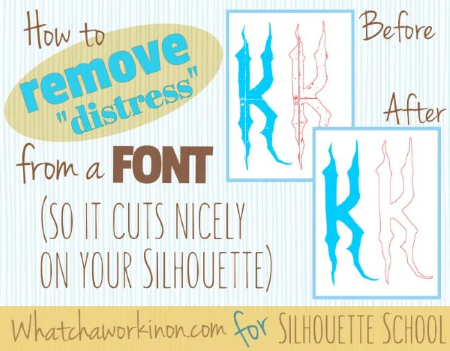
Take the Zombie Holocaust font, for example. Here's the K. Check out the cut lines on this puppy when you remove the fill color:
Ew. It's full of extra scratches and bits. They add charm to the printed letter but, man oh man, what a messy cut.
I *really* wanted to use this font, though. It was just the right mix of gothic creepiness I was after, and I hadn't been able to find another font that was even close. I needed it for only two words, so I decided to remove the "distress", leaving just the letter outlines that would cut well.
It may look like a lot of work, but I broke it down into simple steps with lots of pictures for you so it just seems that way. Once you know what to do, you'll be able to click through it quickly for whatever font you want to de-distress.
THE WORDS
Type out your words, select them, then pick the distressed font you want to de-distress from the font list in the Font Style window.
Start by filling the text with solid black using the Fill Color tool. Black letters offer maximum contrast. Set the Line Color to 'transparent' (that's the crosshatch option in the color palette).
Zoom in so the letters are 3-4" tall on the screen. It's okay if some words are off screen, just be sure to include them in the trace selection box in the next step.
TRACE
We are going to trace the words twice.
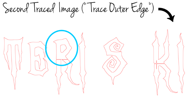
First, do a regular trace (high pass filter off, scale to 4, "Trace"). Drag the original text box down to an empty part of the mat and trace it again. This time click "Trace Outer Edge" instead of "Trace". If you're new to tracing, here are detailed instructions for the tracing method I used.
Now drag the original text box off the mat, leaving the two traced images. You can see in the second image (where you traced the outer edge) that most of the interior distressed bits are gone and the outside edges are a little smoother.
Most of the letters in that version are ready to cut, but the R and K need a little work first. We'll work through all of these to get letters that are perfectly cut-able:
1. Replace the R counter (the center space at the top of the letter)
2. Remove the peninsulas (finger shapes that poke into the K),
3. Reunite the letter parts to make one solid letter.
If your traced images look slightly different from mine, that's okay. The repair steps are the same.
First, SEPARATE THE LETTER PARTS
Ungrouping the letter will allow you to work with them individually. To do this, release the compound path on both images. To do so: Select both traced images, right-click then select 'Release Compound Path' from the list).
It looks busy because all of the individual parts are selected. To de-select them all, simply click anywhere on the empty mat.
1. REPLACE THE COUNTERS
Now we want to replace the counters in letters that have them---R, P, O, etc. To get the exact shape and size needed, steal the counters from the first traced image. One at a time, select a counter shape from the first traced image and drag it into place in the second traced image.
To get this:
For my design the R was the only letter with a counter, so I'm done, but if you have more missing counters, repeat until you've replaced them all. Delete the first traced image.
2. REMOVE THE PENINSULAS
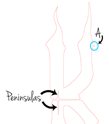 Peninsulas are the finger shapes that poke into the letters. Zoom in on the center part of the K to see what I mean.
When I zoomed in, I also found an extra bit (A). Not sure where it came from, but it's not part of the letter, so buh-bye...select and delete.
All lines and shapes---including letters---are made up of points that tell the lines which direction to go. If you edit the points, you change the shape. To delete a shape or part of a shape, simply delete its points. In this case, delete the points that make up each peninsula. It's easier to see what you're doing if you zoom in so the peninsula takes up most of the screen. I'll start with the top peninsula.
STEP ONE: Double-click on the peninsula to reveal the editing points.
STEP TWO: Select the first point on the right side at the peninsula opening (B). Once selected, the point will change from grey to white.
STEP THREE: In the Point Editing Window on the right, click 'Delete Point' (D) a few times.
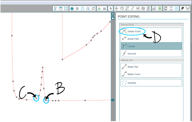
As each point is deleted, the peninsula changes shape. Continue deleting until point C is deleted.
And the top part of the K is fixed---no more peninsula.
Repeat the process for the remaining peninsulas on the K and other letters.
3. REUNITE THE LETTER PARTS
Sometimes you may find a letter is broken up into parts as part of the "distressed" look. In my design, the R and K are like that. The parts need to be put back together to make solid letters. Editing points will do the trick here, too. I'll start by reuniting the top and bottom parts of the K. Again, zoom way in to make the points easier to see.
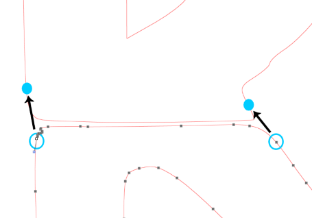
STEP #1: I like to work left to right, so on the bottom left side, select the first point that strays from the letter shape, drag it up to where the letter shape starts to become normal, and drop it on the line (I've marked the landing spot on my K with a blue dot below).
When you release the cursor to drop the point, the point will have a new position (E), which will change the shape of the bottom part. It's still looking pretty icky, but don't worry, we'll have it handled in no time.
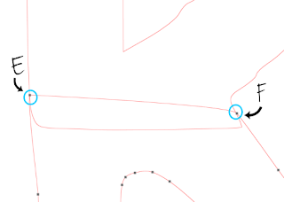
STEP #2: Repeat STEP #1 on right side to get something like this:
(E) and (F) are the re-positioned points.
STEP #3: Delete the points on the bottom part between (E) and (F). You can delete them individually by selecting one point at a time and clicking 'Delete Point' (D) in the Point Editing Window on the right, then repeat for the rest of the points you want deleted.
Or...you can start by deleting the left-most point. After you delete it, the next point in line is automatically selected; so you can keep clicking 'Delete Point' (D) multiple times until you've removed what you want (you don't have to re-select each point manually between clicks). You'll get something like this, with the top and bottom parts overlapping:
STEP #4: Weld the top and bottom parts together (select them both, right-click then select 'Weld' from the list).
And, voila, the two pieces have become one. If you end up with a bump or jagged bit along the edges where the two parts joined, simply delete the points involved to get a nice straight line. On this K, my transitions turned out quite well---the slight bumpiness that remains fits right in with the letter style, so I won't bother smoothing them out.
STEP #5: Repeat STEPS #1 to #4 with the other letters that need reuniting into a single piece.
MAKE THE TEXT INTO A COMPOUND PATH
(Select all, right-click > select 'Make Compound Path' from the list) And that's it. You've removed the "distress"---your text is nice and clean and ready to cut.
Here are the before and after images of the K:
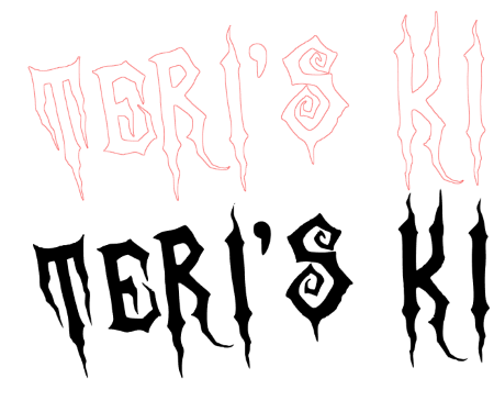
What a difference, hey? The de-distressed version will not only cut better and weed easier, but if you're cutting from adhesive vinyl, it'll be easier to apply and will adhere better, too, without all those little itty bitty bits and narrow sections. And here's my end result:
Something to note: once you've de-distressed a letter, it becomes an image and is no longer editable as text. And since you won't find the de-distressed letters in your font list, if you want to use them in another project, you'll have to access them manually by storing them in a file and copying and pasting as you would any other image.
As I said at the beginning, I'm willing to do the work for a couple of words. And if it were a font I thought I might use again and again and I hadn't been able to find a similar regular font to use instead, I'd probably do the whole alphabet and keep it in a file to re-use.
Thanks for coming along on this tutorial journey with me today. I hope you'll drop in and visit me at the Whatcha Workin' On? blog where I dive into creative projects and tell you all about them so you can, too. You can also find my projects, hints, & sources on Facebook and 'everything Silhouette I don't want to forget' on Pinterest. See you there! Cheers!
-Eff

Note: This post may contain affiliate links. By clicking on them and purchasing products through my links, I receive a small commission. That's what helps fund Silhouette School so I can keep buying new Silhouette-related products to show you how to get the most out of your machine!
Thanks for coming to class today at Silhouette School. If you like what you see, I'd love for you to pin it!

Get Silhouette School lessons delivered to your email inbox! Select Once Daily or Weekly.










.png)


At least I have learned that I can click the delete point multiple times and not have to select a new point again. Thank you so much for this clear tutorial.
ReplyDeleteI know!! I kept thinking there had to be an easier way than one by one. :)
DeleteThanks for the great instructions! I found that there is a way to do this without tracing if you don't need or want the smoothing effect of the trace:
ReplyDelete1. After you type the words, right-click--> Release Compound Path, then ungroup. Click away from the design so nothing is selected.
2. Zoom in. While holding down the shift key, select the outline of each letter AND any counters. Group, then move the letters away from the "distressed bits."
3. Proceed with the original instructions starting at 2. Remove the peninsulas.
I hope someone finds this helpful!
This is exactly what I was going to say! I did this just the other day with a distressed font. So much easier than described above. Just proof there's always more than one way to skin a cat ;)
DeleteOh, yes, :^) that there are multiple ways to do things is one of the things I love about working in Silhouette Studio. Thanks for pointing out another for specific font types.
DeleteMy goal here was to come up with a universal method---one that would work on all distressed fonts, and for all user skill levels, so even newbies would be successful regardless of their font choice. When you're new to the ways of Silhouette, you don't really have the context to know if a font needs smoothing or is easy or complicated as distressed fonts go, and I didn't want newcomers to have to worry about analyzing a font and having to decide which way they needed. Once users become familiar enough with the software and their own skill set, and they develop a sense about these things, as you guys have done, it's pretty cool that the tools are versatile enough to accomplish the same thing in different ways more suited to specific situations.
Since that time I bought my Silhouette Cameo past spring, I’ve been wanting to experience cutting vinyl. Thus, during the Dark-colored Friday sale past month, I finally obtained the vinyl starter kit and many
ReplyDeleteother fun shades. Since I’m a beginner vinyl individual, I thought I’d write about my first ever project. Just should there are another beginners out generally there! It wasn’t perfect, but I think the result was worth the item.
Thank you so much for all of your tutorials. One of these days I'm going to sit down and learn the Silhouette DE software. I've been doing all of my design and editing in Inkscape.
ReplyDelete